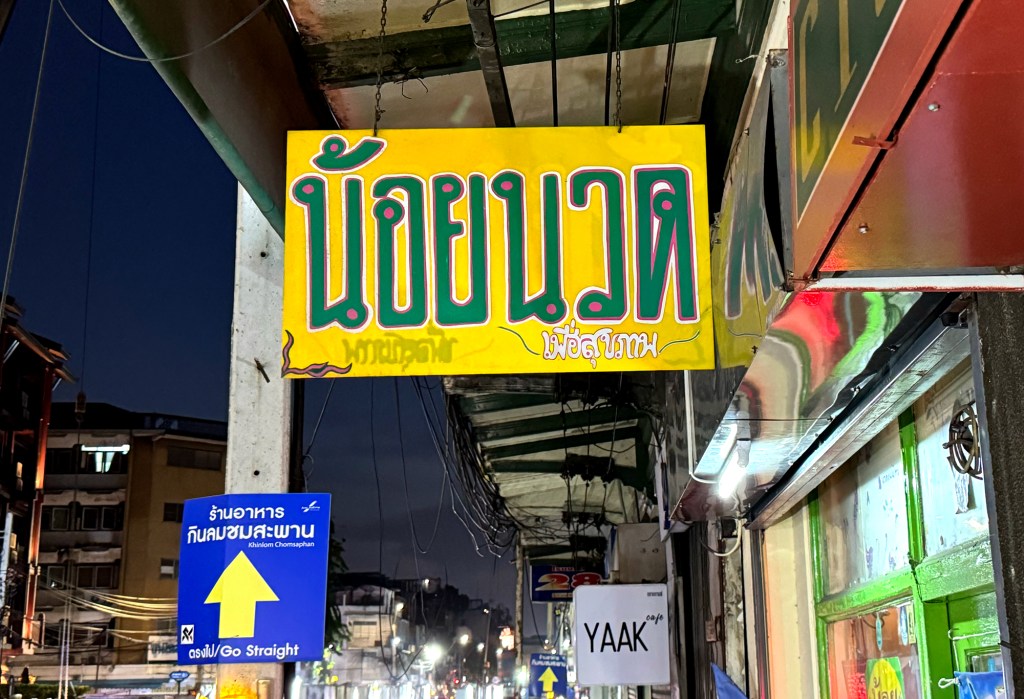
Here comes another piece truly one of a kind. It looks 100% hand painted, probably belonging to a hair salon. I’m obsessed with the contrast and the color combo: that green and yellow? Perfect match. I don’t think anything could look better together. Such a charming yet simple signage, still original!
It’s been a while since I last updated my blog or snapped any street shop signs around Bangkok. My bad, work caught up with me. And honestly, juggling a full-time job with a hobby can be really tough. But recently, I gained my freedom again back to strolling mode and finally have time to wander the city – again!.
Which brings me to this beautiful sign I stumbled upon near Thewet Pier in the Old Town. (Yes, Thewet—“the wet,” not “the dry.” I swear, some place names in Bangkok are so much more exotic than where I come from. If you know, you know: People Road, People Square… People this, People that almost everywhere.)
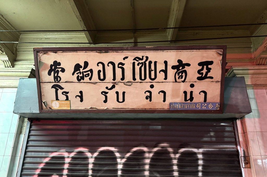
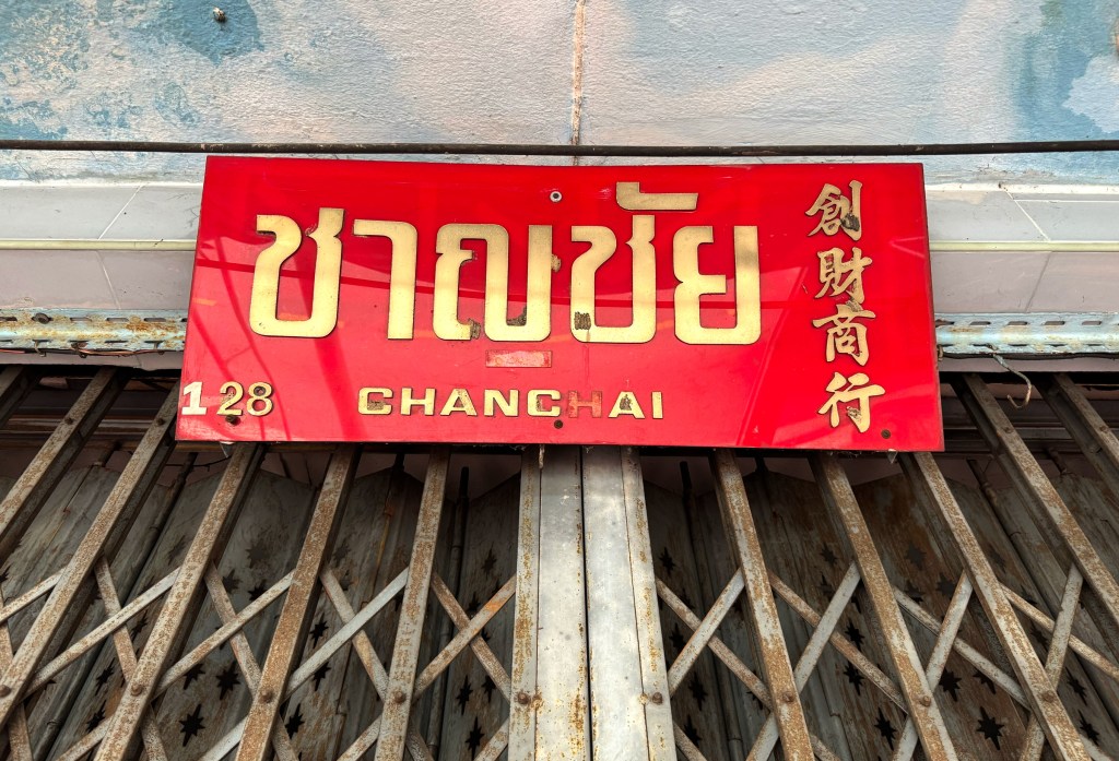
This sign belongs to a pawn shop, an old one, from the look of it. I can’t read Thai, but the Chinese name beside it caught my eye. The calligraphy style is so unique; it reads “Asian Business Pawn Shop.” What’s fascinating is how the Chinese characters blend seamlessly with the Thai script.
That’s exactly why I had to stop, admire it, and snap a photo to share with you. Vintage pieces like this are getting rare, and every one feels like uncovering a little piece of history.
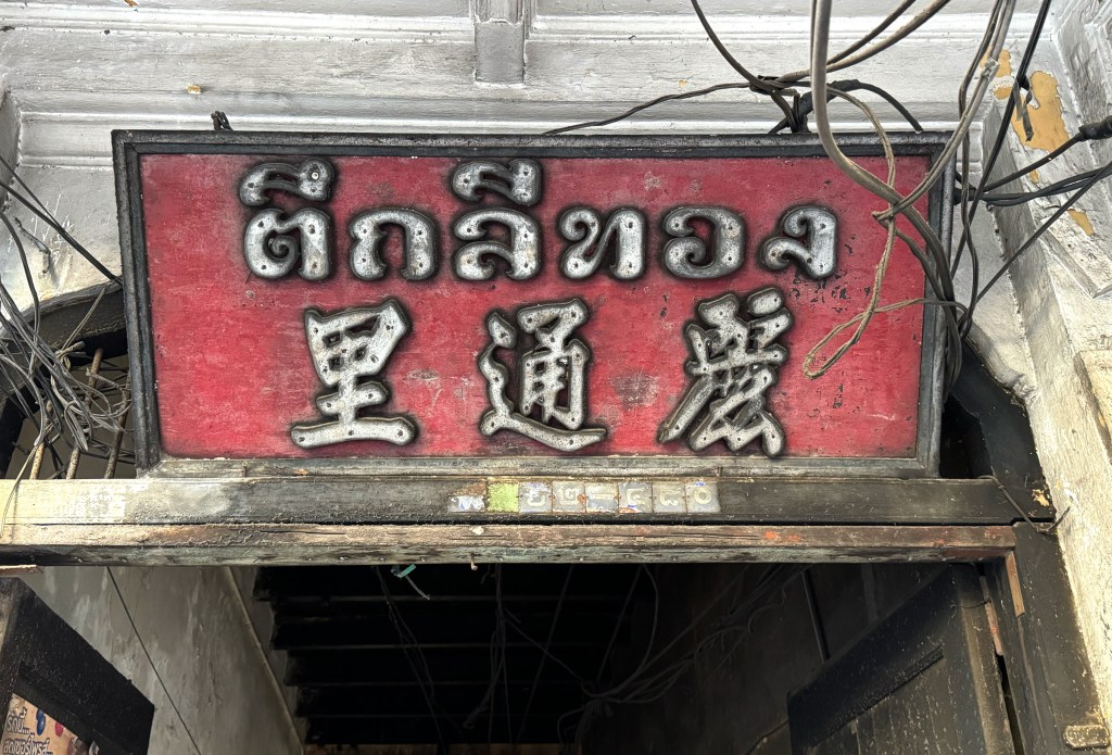
This beautiful signboard marks a small alley in Chinatown called Lee Thong. Set on a rich red wooden board, the elegant Thai and Chinese fonts give it a timeless feel. The alley itself is fascinating, lined with tightly packed houses and full of hidden character.
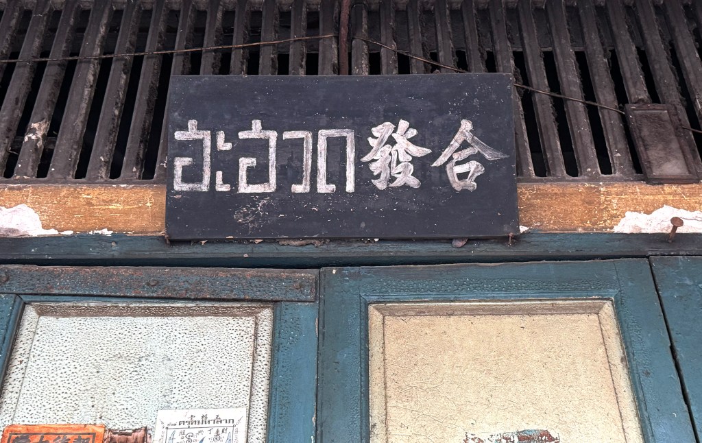
You don’t often come across hand painted signboards these days, which makes this one feel like a rare gem. it has the charm of chalk on a blackboard minimal but quite special. Being a shop in Chinatown, the sign naturally blends both Thai and Chinese scripts, giving it an authentic touch. It’s likely been around for a few decades, carrying with it a quiet sense of history.
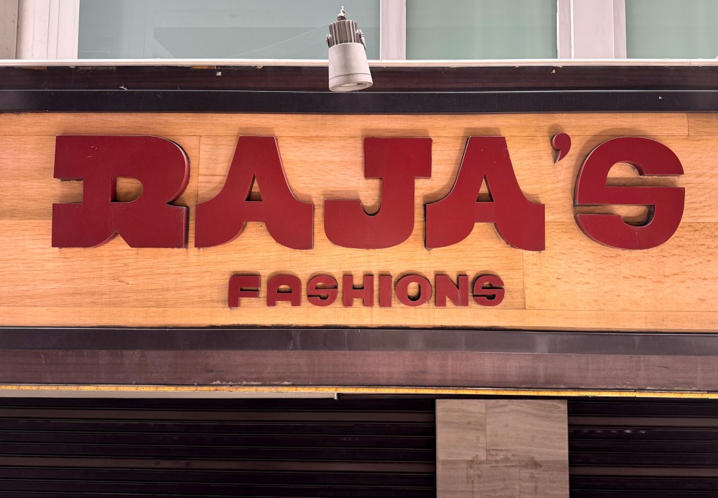
I have no idea what this font is, but I just love the way it looks (could be a customized typeface, but the font for fashions under the main logo just not so well executed). anyway, this shop sign belongs to a family owned tailor shop located in Sukhumvit. If you are fancy a nice tailor made suit this seem a good place to go.
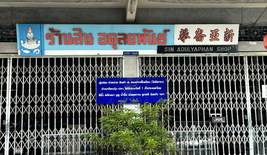
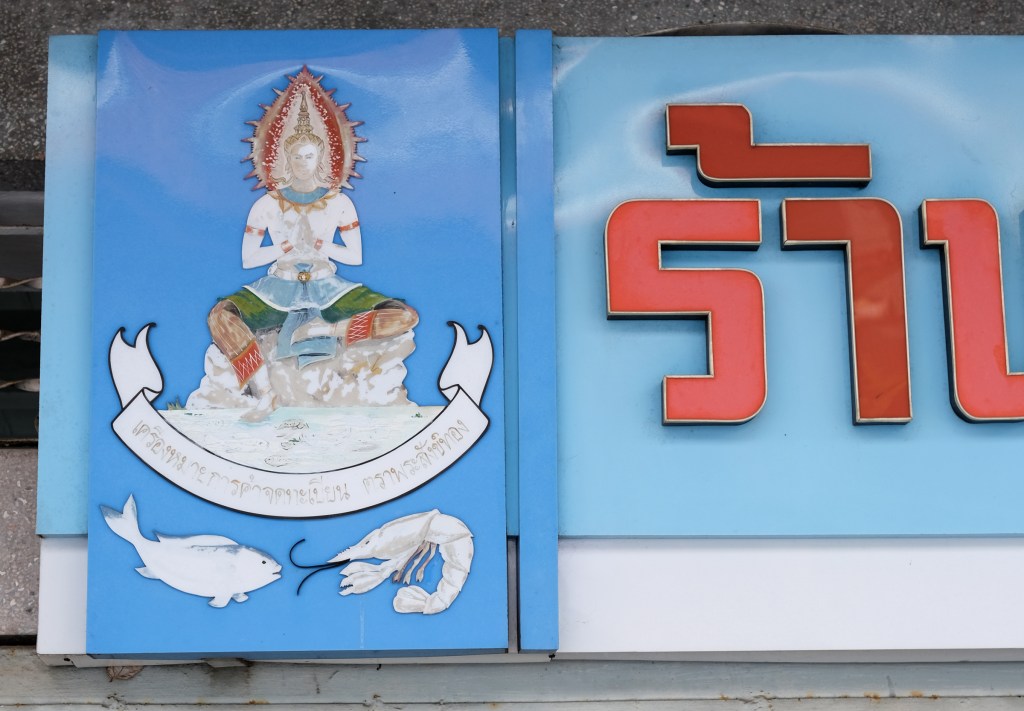
Another gem I came across, this time from Songkhla. Sin Adulyapahn is a shop selling local specialties like soy sauce and dried seafood. Established in 1925, it still proudly stands in the old town. The shop’s sign design is truly eye-catching, especially its distinctive logomark: a Thai angel holding a shrimp and fish (which I absolutely love so Thai and so original). The typography is also worth noting, three languages, each with its own font and background color. The result? A beautifully balanced and visually striking aesthetic.
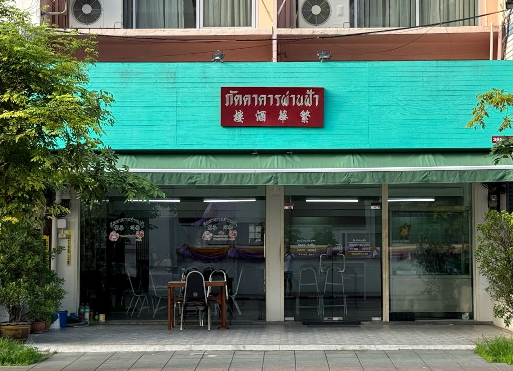
Wow, what an unexpected sign for a restaurant! Just look at the size and proportion, it’s such a tiny signboard for such a big place. The amount of empty space is massive! But they really nailed the color combo, bold red on a tortoise green backdrop. And the way that small sign hangs on such a large facade? So intriguing.
This clothing shop near Khao San Road mostly sells school uniforms, maybe that’s why the store sign feels so playful. It’s beautifully designed and definitely not something you see very often these days. A real gem of a sign!
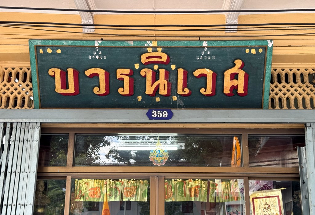
I honestly have no idea what this shop does, it’s located on Khao San Road, right across from the stunning Wat Bowonniwetwiharn Ratchaworawiharn (what a name!). What really stood out to me, though, is the signboard: hand-painted Thai script in gold and red on a dark green wooden background. It’s beautifully vintage and full of character.
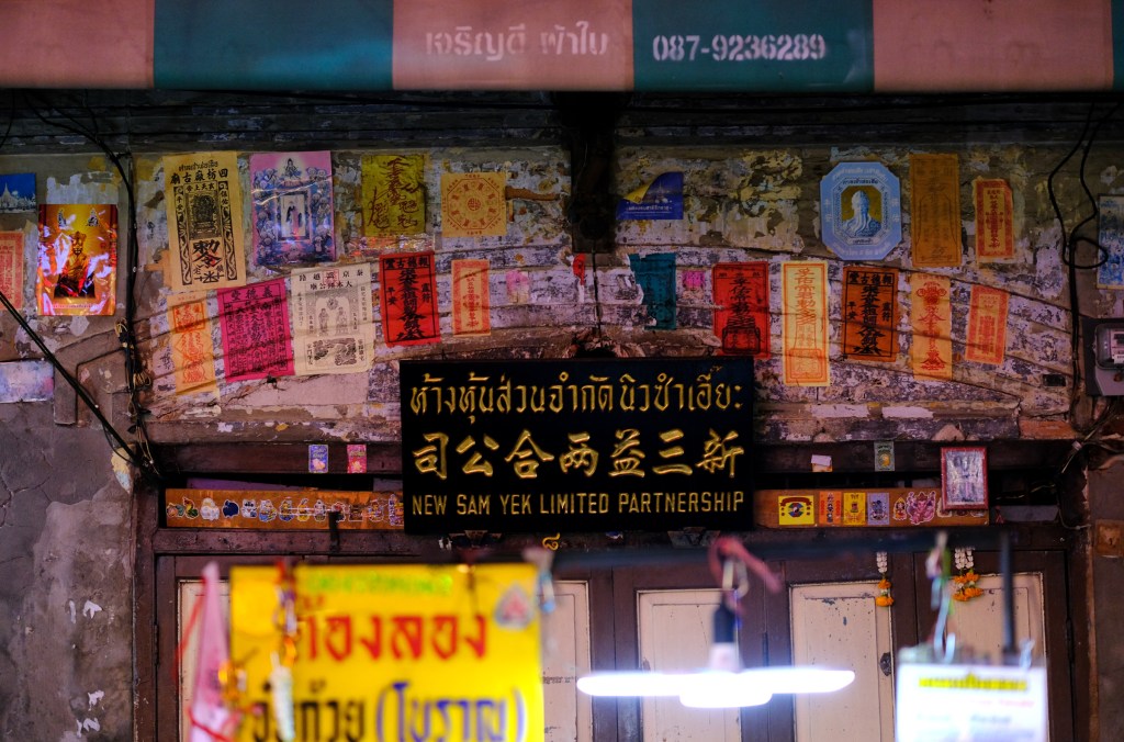
I’ll admit what caught my attention with this signage wasn’t the signboard itself. It’s actually a very typical style you’ll see across Bangkok: three languages, gold lettering on a black background classic Thai-Chinese business aesthetics. What really drew me in were all the different talismans surrounding it. Just look at them, each one with its own color, shape, and design. It’s such a fascinating, vibrant display. This shop feels truly blessed.
Location: Plaeng Nam Rd, Samphanthawong, Bangkok 10100
It might be just another ordinary shop tucked away in a small soi in Chinatown, but this sign really caught my eye. Maybe it’s the simplicity, the classic color combination, or the glossy, reflective material whatever it is, it just looks beautifully to me.
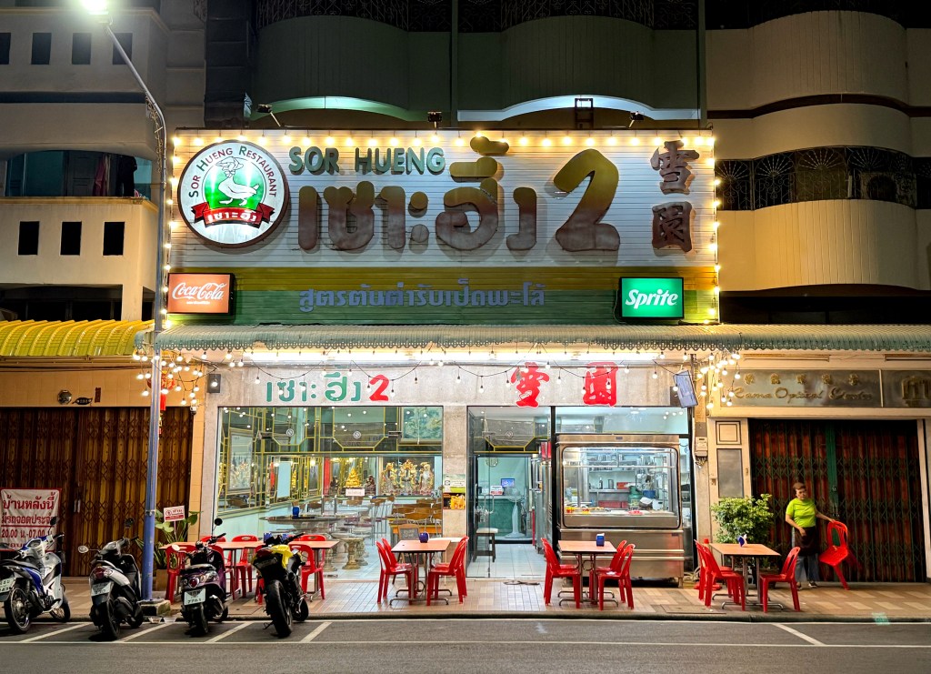
Also spotted in Hat Yai this restaurant has a massive, eye-catching sign that’s quite a visual experience. The layout is a bit busy, but that’s part of its charm. The Chinese name, “Snow Garden,” is written in a bold, old-school traditional font that adds to its nostalgic appeal.
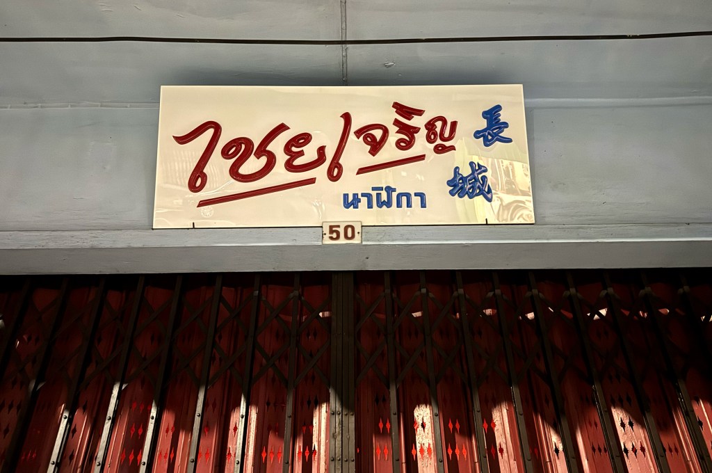
This one is too good not to share. Although it’s not from Bangkok, I came across this amazing storefront sign during a recent trip to Hat Yai, a southern Thai city rich in Thai, Malay, and Chinese influences. I’m not exactly sure what the shop sells (Google Translate didn’t help much!), but the Chinese characters say “Great Wall,” which I assume is the shop’s name. Just look at the Thai script so beautifully designed, sitting perfectly alongside the traditional Chinese type. It’s such a cool example of cultural blend through typography.
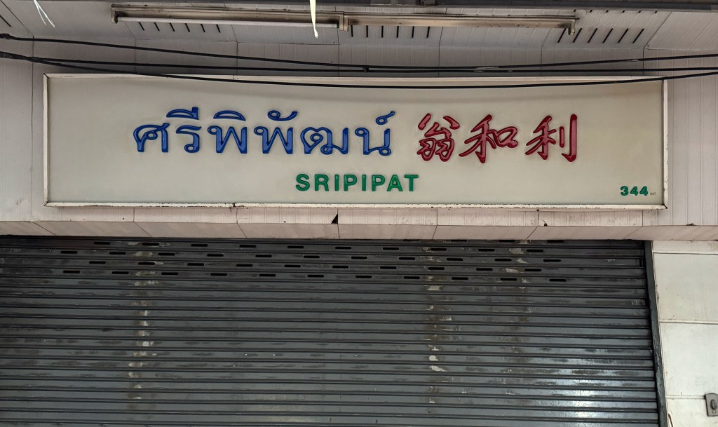
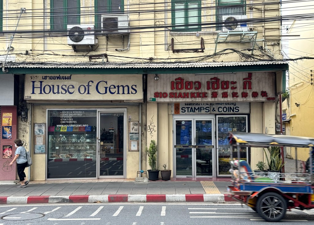
Located on my favorite street in Bangkok, Charoen Krung Road, this charming coin and stamp shop sits right next to a gemstone and jewelry house. Its retro storefront sign featuring Thai, English, and Chinese stands out with chubby, bold lettering in classic red against a simple backdrop. All three typefaces are harmoniously styled, giving the shop a timeless, nostalgic feel.
Location: 1216 ถ. เจริญกรุง Bang Rak, Bangkok 10500
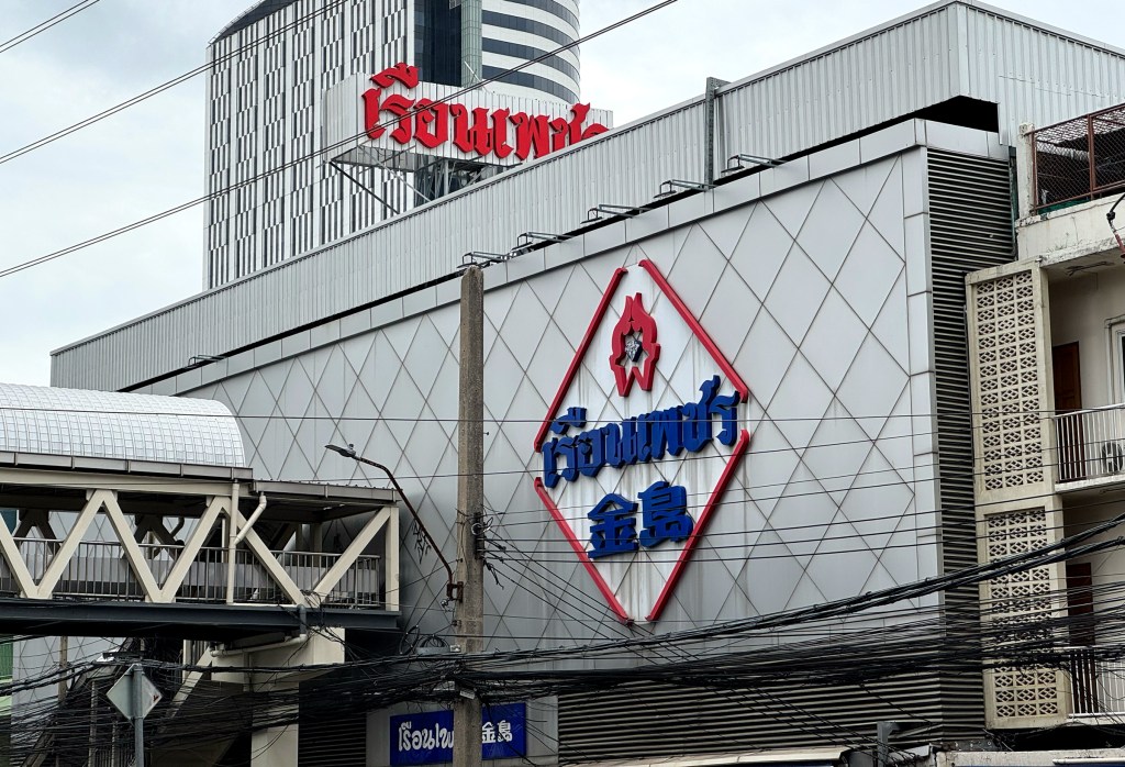
Ruen Petch Suki is a Thai-Chinese hotpot restaurant established in 1968. The main restaurant features a distinctive logomark that includes both its Thai and Chinese names, the latter translating to “Gold Island.” What first caught my attention was the beautifully designed traditional Chinese typography, which adds a timeless character to the brand. The red and blue color palette is simple yet powerful, symbolically representing both cultural heritage and the national colors of Thailand.
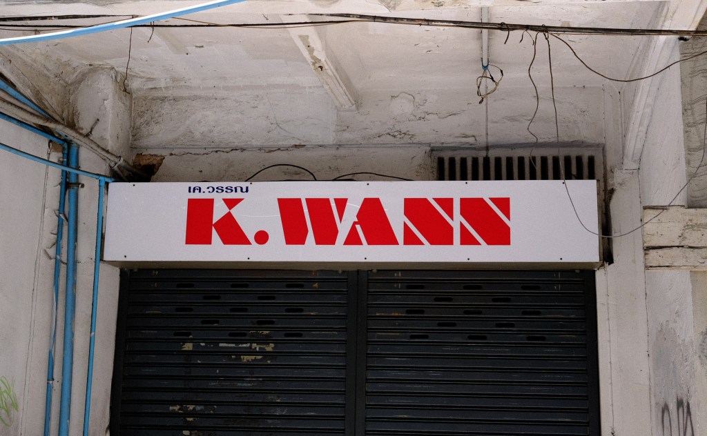
I instantly loved this signage purely for its simplicity and the geometrically designed letters. I believe it’s a jewelry manufacturer, given its location on Charoen Krung , the iconic street known for jewelry and gemstones. The English type is especially striking, with bold red letters set against a clean white background. Truly eye-catching!
I just love how red and gold signage looks, especially when paired with beautifully designed fonts. This is a classic example of how simplicity, combined with the right color combination, can be so effective.
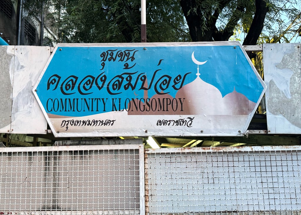
Passed by this Muslim community sign on my walk home this evening and thought I’d share it with you all. The sign features both Thai and English text, the Thai font resembles JS Wansika ( I could be wrong tho), giving it a very traditional look. Interestingly, I expected the typography to have more Arabic influence, but the classic Thai style stands out beautifully in its own way.
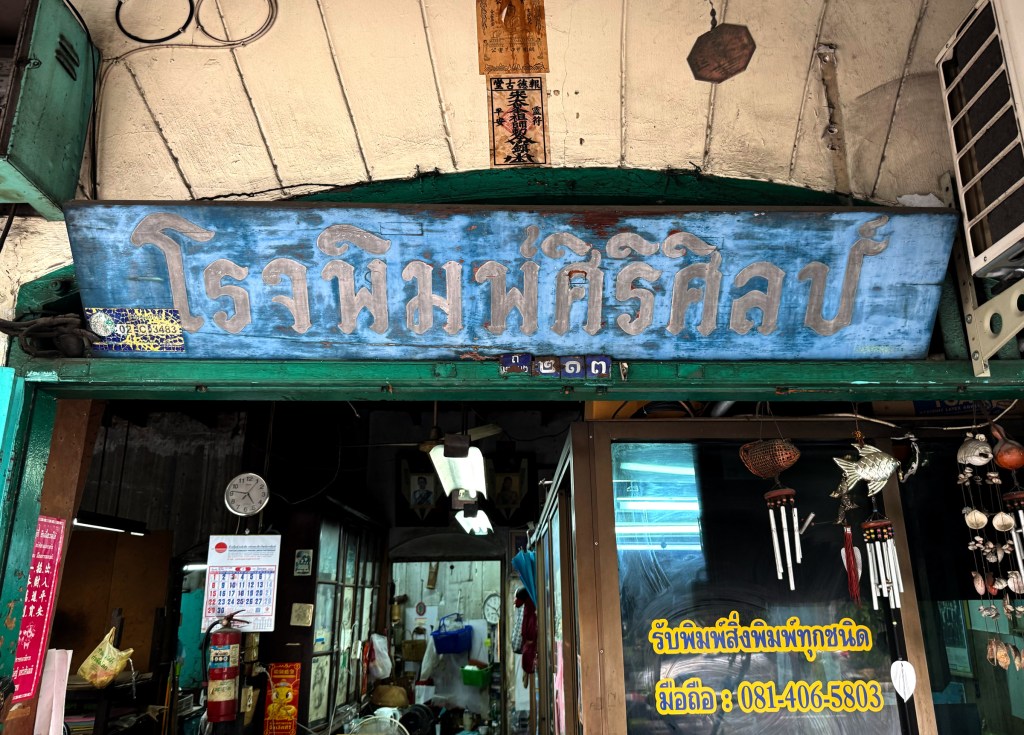
I couldn’t quite make out the name of this shop as its all in Thai, but I know it’s a print shop, how? Because inside, I spotted a few vintage Heidelberg presses. So cool! Probably every graphic designer’s dream to work with machines like these. And speaking of dreams, the signboard itself is a vintage beauty hand-painted with so much character and charm.
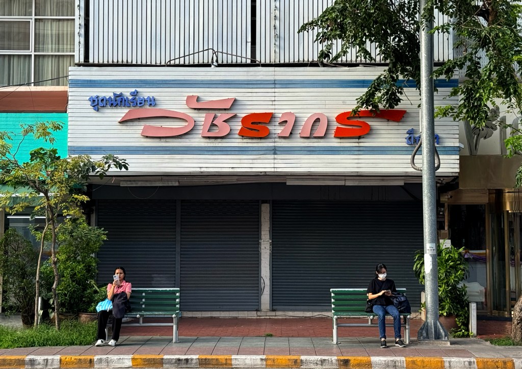
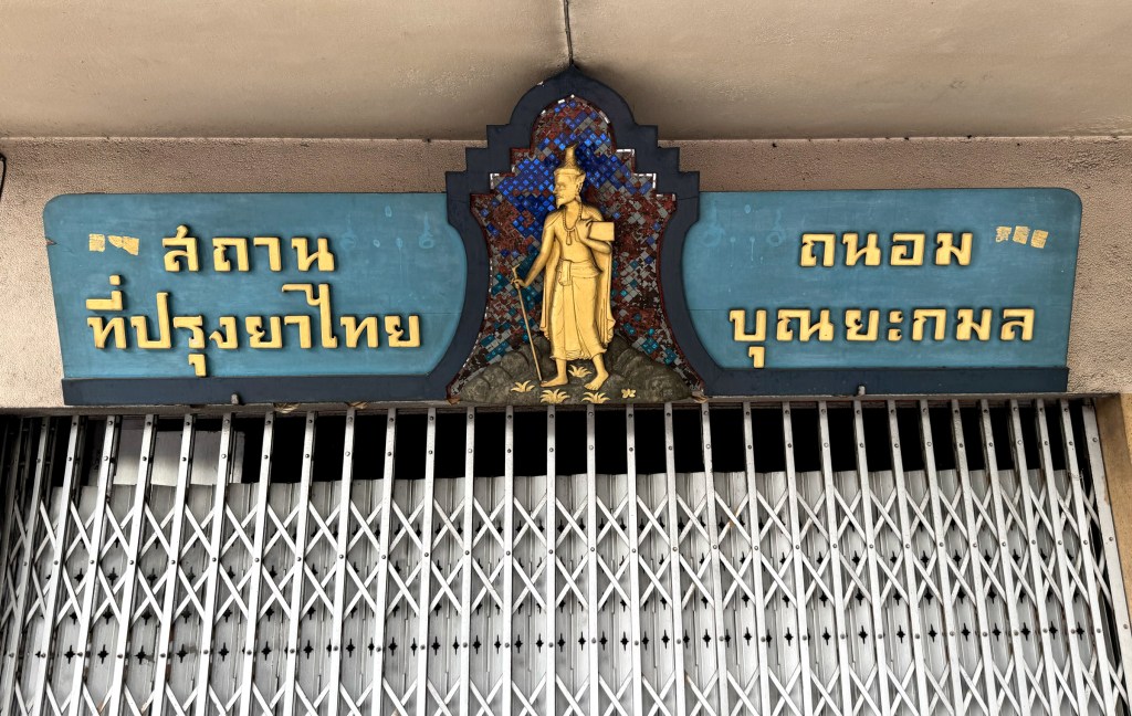
This beautiful signboard belonged to a traditional Thai medicine pharmacy. Sadly, it seems the business has closed down, but its legacy lives on through this stunning piece of signage. A quiet reminder of the past, preserved in type and timber.